Helping international students navigate daily life with more confidence and less dependence
Starting life in a new country can be exciting, but the first few months are often filled with hidden challenges. Everyday tasks like shopping, banking, commuting, and renting become difficult when systems and norms are unfamiliar.
ROLE: Worked closely with a team of four, leading research synthesis and shaping the product direction. Took ownership of key features and user flows, translating insights into high-fidelity prototypes and testing them with users.
TIMELINE: 12 weeks · September to November 2024
TEAM: Academic project with a 4-person team

When Simple Things Feel Difficult
International students do not struggle with just one thing when they arrive in the U.S. They face a chain of small but important challenges across housing, transportation, finance, shopping, and social adjustment.
Most support exists but is scattered across WhatsApp groups, roommates, seniors, and informal advice, making the experience stressful for newcomers and exhausting for those constantly asked to help.
Quick TL;DR of the case study


Now, let’s get into the details
#1 The design challenge
How might we help international students navigate their first months in a new country with more confidence, while reducing the burden placed on experienced students?
#2 Why this problem mattered
This project began with a simple observation: many of the hardest parts of moving abroad are not dramatic, they are daily.

These were not isolated problems. They formed a larger pattern of dependency and uncertainty. For newcomers, that meant hesitation, embarrassment, and stress.c For seniors, that meant repeated requests, emotional fatigue, and burnout.
Easy Nest was designed to address both sides of that experience.
Understanding the context
We grounded the project in both broader context and lived experience.
International students contribute significantly to the U.S. economy, yet many still face financial, social, and cultural friction during their transition. Early conversations showed that students were often unsure whether they had enough money to sustain themselves, were more likely to experience isolation, and relied heavily on part time work and peer support to manage daily life.
But numbers alone did not explain the experience. To design something useful, we needed to understand what daily adjustment actually looked like on the ground.


#2 Research approach
We used a mix of interviews and in-context observation to understand how students adjusted to life in the U.S. and where they experienced the most friction.

Interviews with newcomers and experienced international students

In the wild observations in everyday environments such as grocery stores and malls
Affinity diagramming to cluster patterns and behaviors

Empathy mapping to understand emotional and behavioral drivers
Why this approach
Interviews helped us understand the emotional and social side of adjustment. Observation helped us catch challenges students might not explicitly mention, especially in moments of hesitation, confusion, or dependence.
This combination gave us a more complete picture: not just what students said, but what they struggled with in real situations.
#4 What we learned
Four recurring themes consistently appeared across interviews and observations.
🧐
Everyday systems felt unfamiliar
Students were not just adapting to a new place. They were adapting to new ways of doing ordinary things, from self checkout to reading bus routes to understanding hidden charges.
💳
Financial stress was tied to uncertainty
The problem was not just limited money. It was the lack of clarity around how much things really cost, how credit worked, and what mistakes might be expensive.
🤷🏻♀️
Help existed, but it was fragmented
Useful advice often lived in private chats, scattered groups, or repeated verbal explanations. Students had support, but no structured way to access it when they needed it.
👥
Peer support came with hidden burnout
Experienced students wanted to help, but repeated one on one questions created fatigue over time. What looked like community support was not always sustainable.
Voices from research
A few quotes captured the emotional weight behind these patterns:
Aish | Grad Student
Everything here is a learning experience, but it is a lot to take in at once.

I always ask my roommate how coupons or taxes work. I would be lost otherwise.
Nikitha | Grad Student
Yash | Senior
Constant WhatsApp questions about housing and banking get exhausting.

These were not just isolated frustrations. They pointed to a system where support depended too much on who you knew, how comfortable you were asking for help, and whether someone had the energy to respond.
From research to insight
To move from observations to design decisions, we synthesized findings through affinity mapping and empathy mapping.
This helped us see that the problem was bigger than information access. Students were not only missing answers. They were missing:


One insight became especially important:
#5 Defining the users
As we synthesized the research, two distinct user perspectives emerged. These perspectives helped us frame the problem more clearly. This was not just about helping one user group. It was about balancing the needs of both sides of a support ecosystem.


The Newcomer

The Experienced Student
Product strategy and prioritization
#6 Ideation
During ideation, we explored a wide set of possibilities:


🏷️
🏘️
🚗
💬
🛍️
🌐️
At first, it was tempting to include everything. But not every idea deserved the same weight. To narrow the solution, we prioritized ideas using three questions:
#1
Does this solve a high frequency student pain point?
#2
Does this reduce dependency, not just shift it somewhere else?
#3
Can this realistically live inside one connected product experience?


This helped us focus on a product concept built around four core needs:
This made it possible to support multiple teams, maintain consistency across flows, and reduce confusion.
What we intentionally did not prioritize
We chose not to build a deeply personalized finance tool, transportation planner, or housing verification system in the first version. These were valuable ideas, but they would have expanded the scope too far and required a level of operational trust, moderation, or external integration that was beyond the timeline of the project.
That decision helped keep Easy Nest focused and believable.
The Product Vision
A single place where students can ask, find, save, and share without depending on fragmented chats or repeated peer support

Solution overview
The final concept brought together four core experiences:


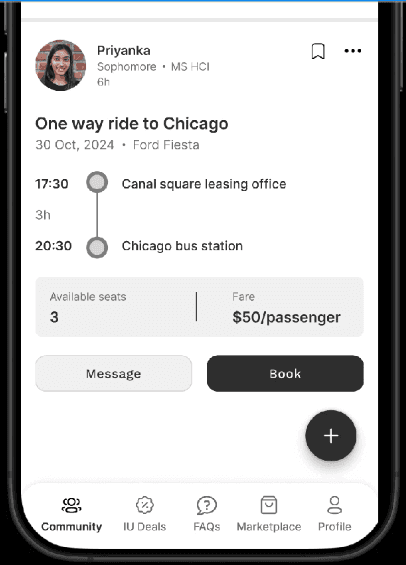
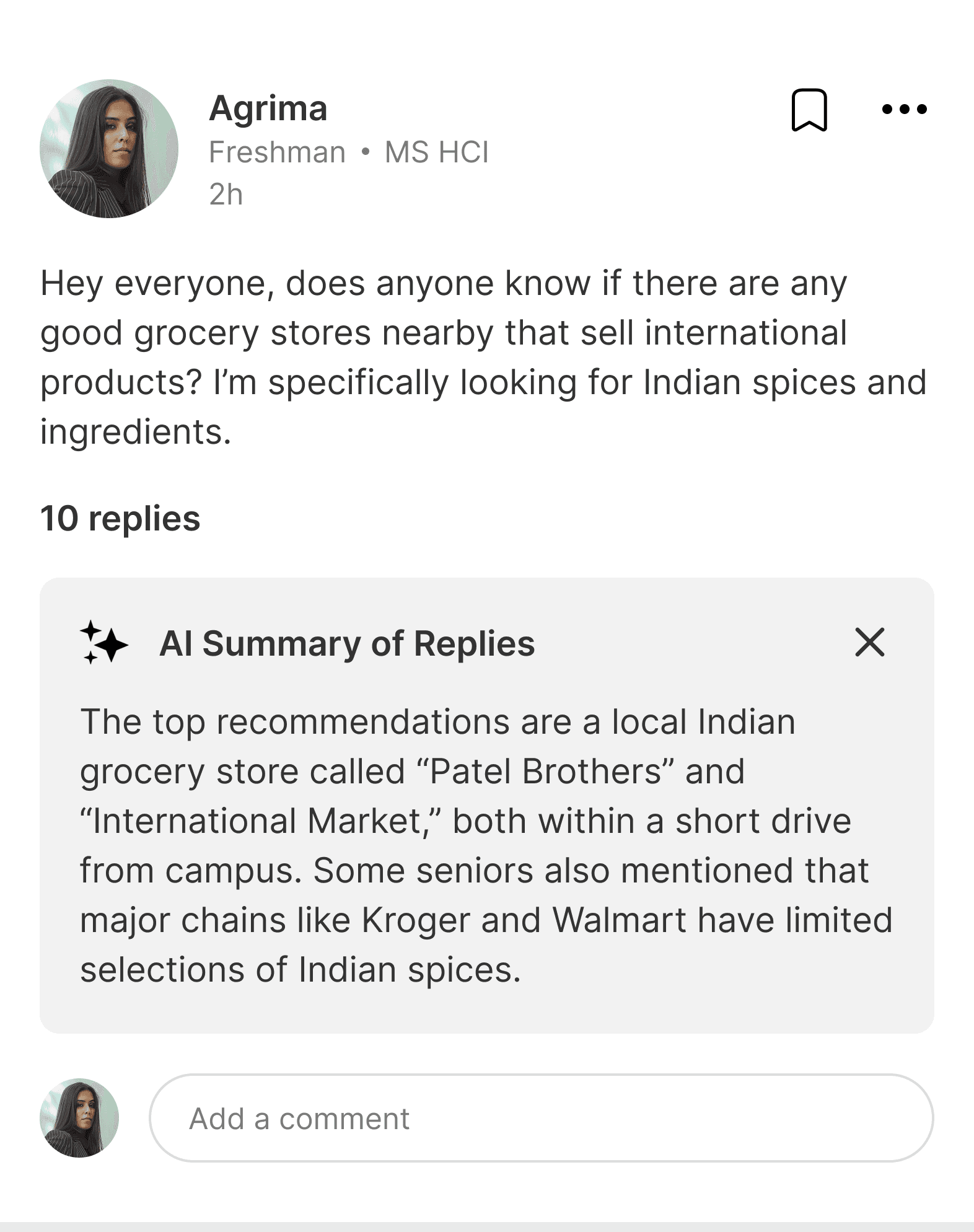
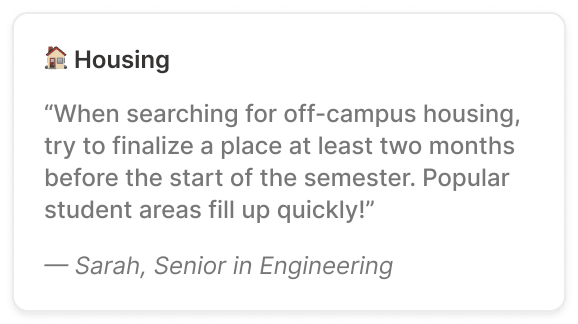
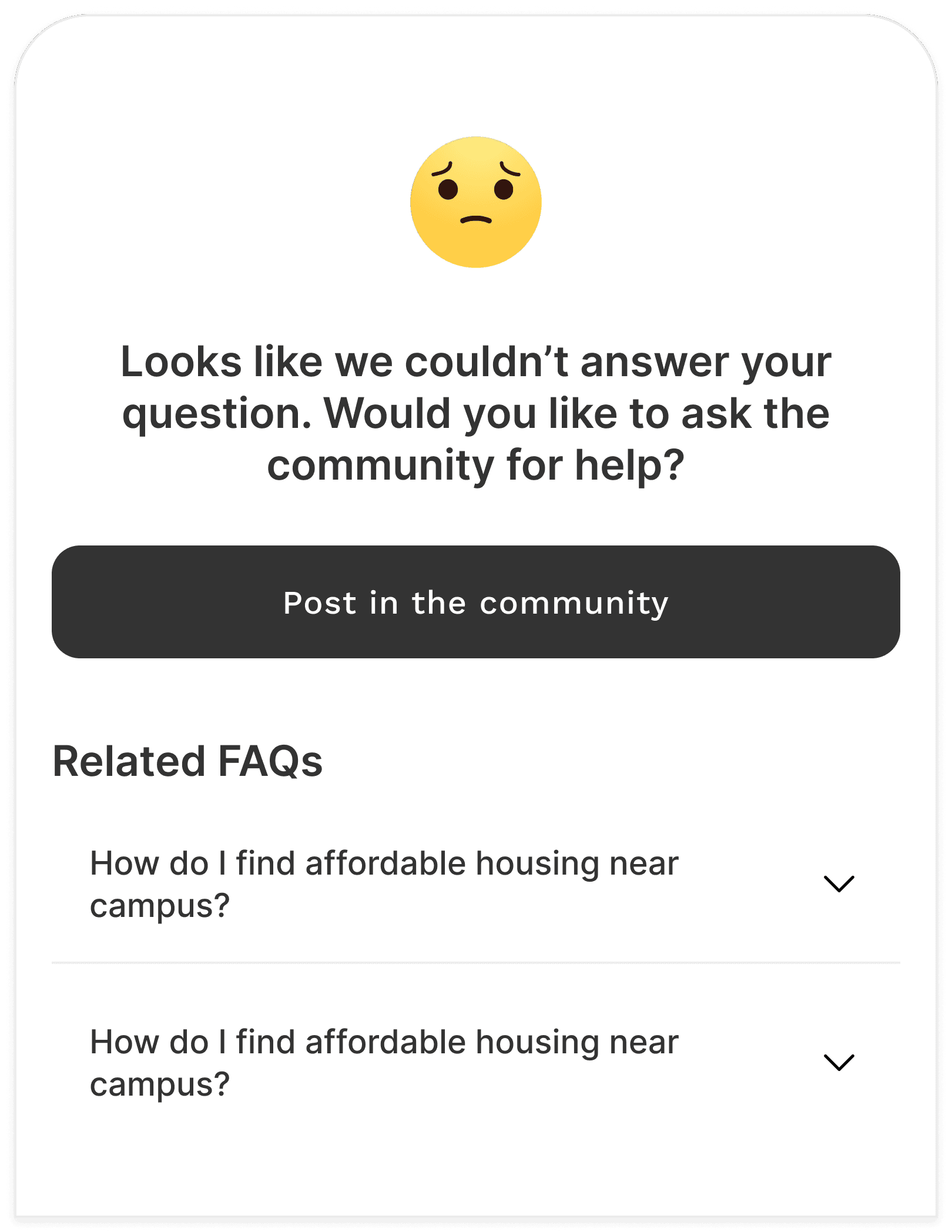
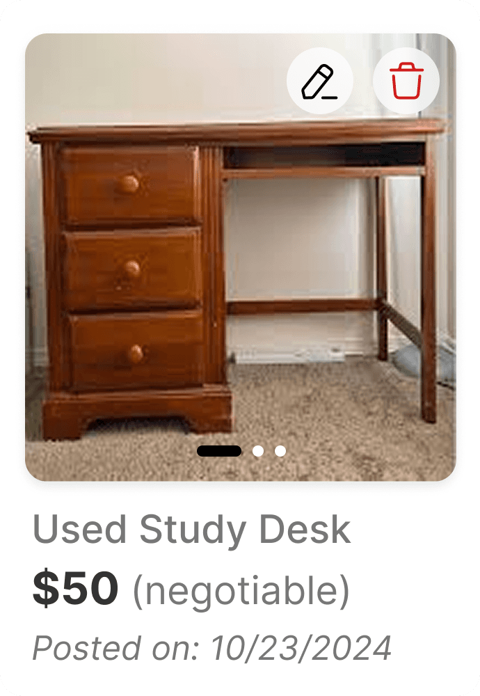
Community Hub

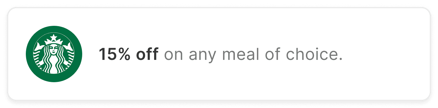
Deals
FAQ
Marketplace
Each feature supported a different part of the same goal: reduce confusion, reduce repeated dependence, and make adjustment feel more manageable.
#7 Information architecture
One thing we wanted to avoid was making the app feel like a collection of unrelated tools. So we built the experience around a simple navigation structure, where each tab represented a recurring student need rather than a disconnected feature.
Navigation structure: Community → Deals → FAQ → Marketplace
This made the product easy to understand at a glance and allowed students to move between asking for help, finding answers, and taking action without losing context.
Core user flows
These flows were important because they connected product value back to the original insight: Support should be easier to access and easier to sustain. The product centered around a few high value flows:

Flow 1: A newcomer has a question
🏷️
Flow 2: A student wants to save money
🪑
Flow 3: A student needs affordable essentials
🌐️
Flow 4: A student wants help without direct dependence
Feature deep dive
#8 Final Design Highlights
Each feature addresses a core challenge identified in research, translating insights into simple, practical solutions.


What we tested
#9 Usability Testing
Once the prototype was ready, we conducted heuristic evaluation and think aloud usability testing with both newcomers and experienced students.
What we wanted to learn:
Could users find key features without guidance?
Did the app reduce hesitation around asking for help?
Were high frequency tasks easy to complete?
Did the product feel trustworthy and clear?
What we found
Testing showed that the concept was valuable, but the interaction details still needed work.
🤔
#9 Iterations based on feedback
Improved clarity and reduced friction through better visibility, simpler forms, clearer feedback, and task shortcuts.
✨
By the end of the project, Easy Nest had evolved from a broad support idea into a focused product concept that helped students. Observed impact includes:
👥
↓ reduced reliance on peers for repeated support
📈
↑ increased confidence in completing daily tasks
👍🏼
↑ positive emotional response to the tone and guidance of the product
What I learned
This project changed the way I think about support products.
1) What appears as a lack of information is often a deeper issue of access, structure, and usability.
2) Good UX should reduce reliance on others by making support accessible and self-serve.
3) Not every idea needs to be built. Focus on what creates the most impact and defer the rest.
3) Not every idea needs to be built. Focus on what creates the most impact and defer the rest.
3) Not every idea needs to be built. Focus on what creates the most impact and defer the rest.