Fighting Hunger Through
Smarter
Logistics
Designing a decision-support tool for Nine13 Logistics — a nonprofit delivering food to thousands of Indianapolis families who can't reach a pantry on their own.
ROLE: Led UX thinking from research to mid-fidelity, translating complex findings into clear product direction. Defined system structure, key interaction flows, and decision-support concepts based on real-world logistics needs.
TIMELINE: September 2025 - Present
TEAM: Capstone project completed as part of a four-member product design team - Shruti R., Agastya D., Shraddha K.
Quick TL;DR of the case study

The Problem
Nine13 Logistics delivers food to 1,000+ Indianapolis families weekly but every growth decision (add a truck? hire a driver? take on a new pantry?) was made on gut instinct. No data. No way to model what it would actually cost or deliver.

What I did
Led UX from research to final design on a decision-support tool that translates a complex engineering model into something a nonprofit coordinator can actually use. That meant field research, ride-alongs, two rounds of user testing, and a lot of deliberate descoping.

Key idea
Every scaling decision lives in the tension between three things: effectiveness (OMOE), cost (OMOC), and risk (OMOR). The tool makes that tradeoff visible in plain language, before Nine13 commits to anything.

✨
What changed is that teams no longer chase emails, requests now move in real time, and nothing gets lost between handoffs.
3.2 ➡️ 4.2
User satisfaction after first redesign
10 minutes ⏱️
for two non-technical executives to navigate a complex engineering model
View Final Screens
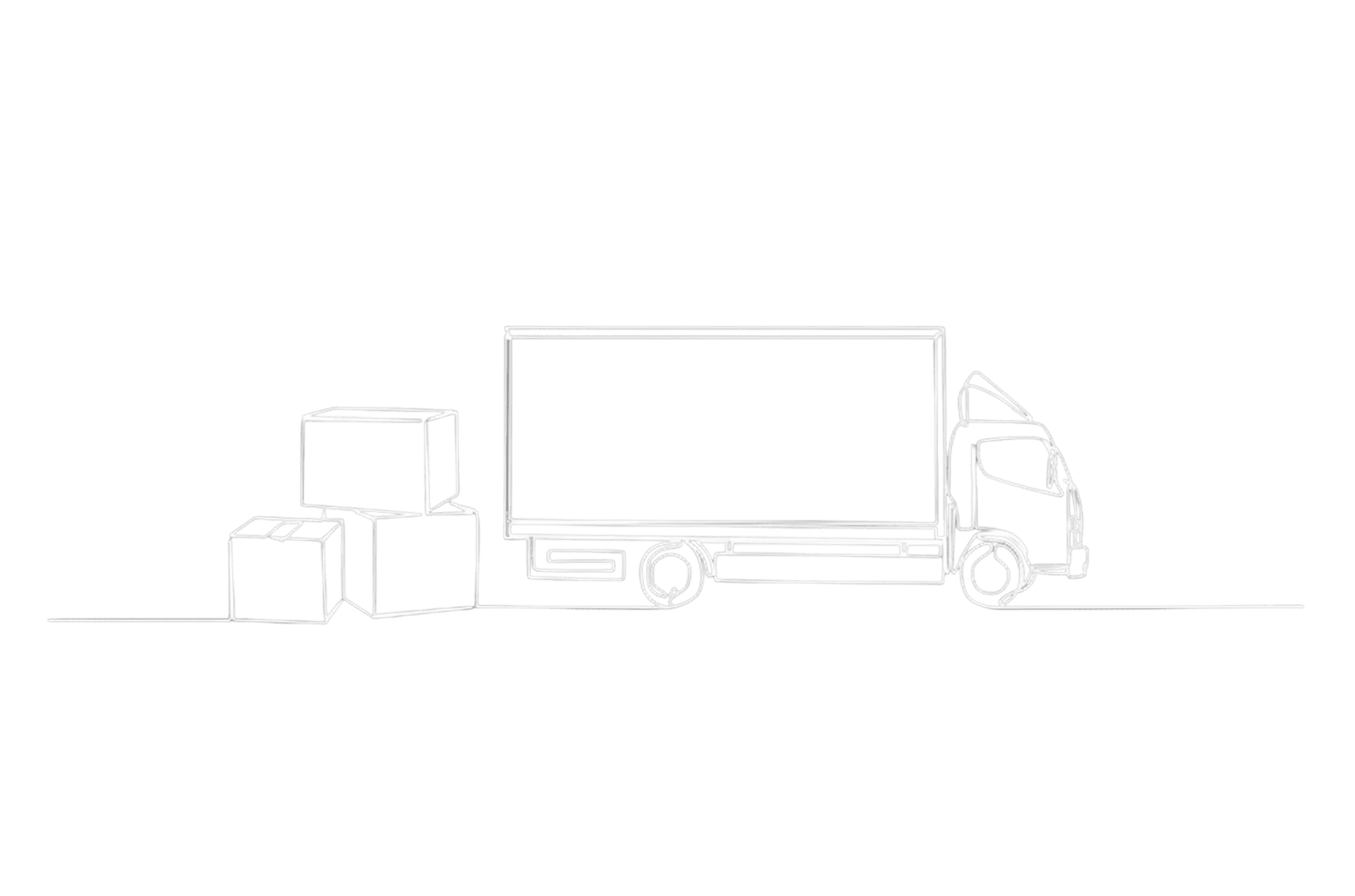
Access, made easier
What looks like a simple delivery is often the difference between access and absence. Nine13 Logistics helps make that access possible.
Overview
The Last Mile is the Hardest Mile

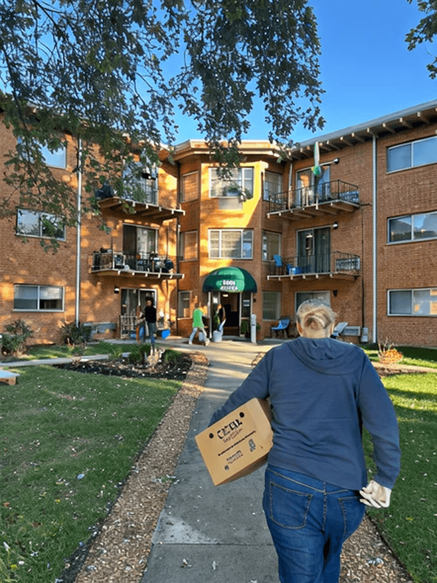
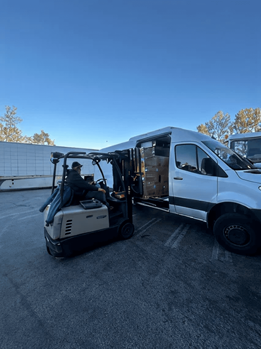
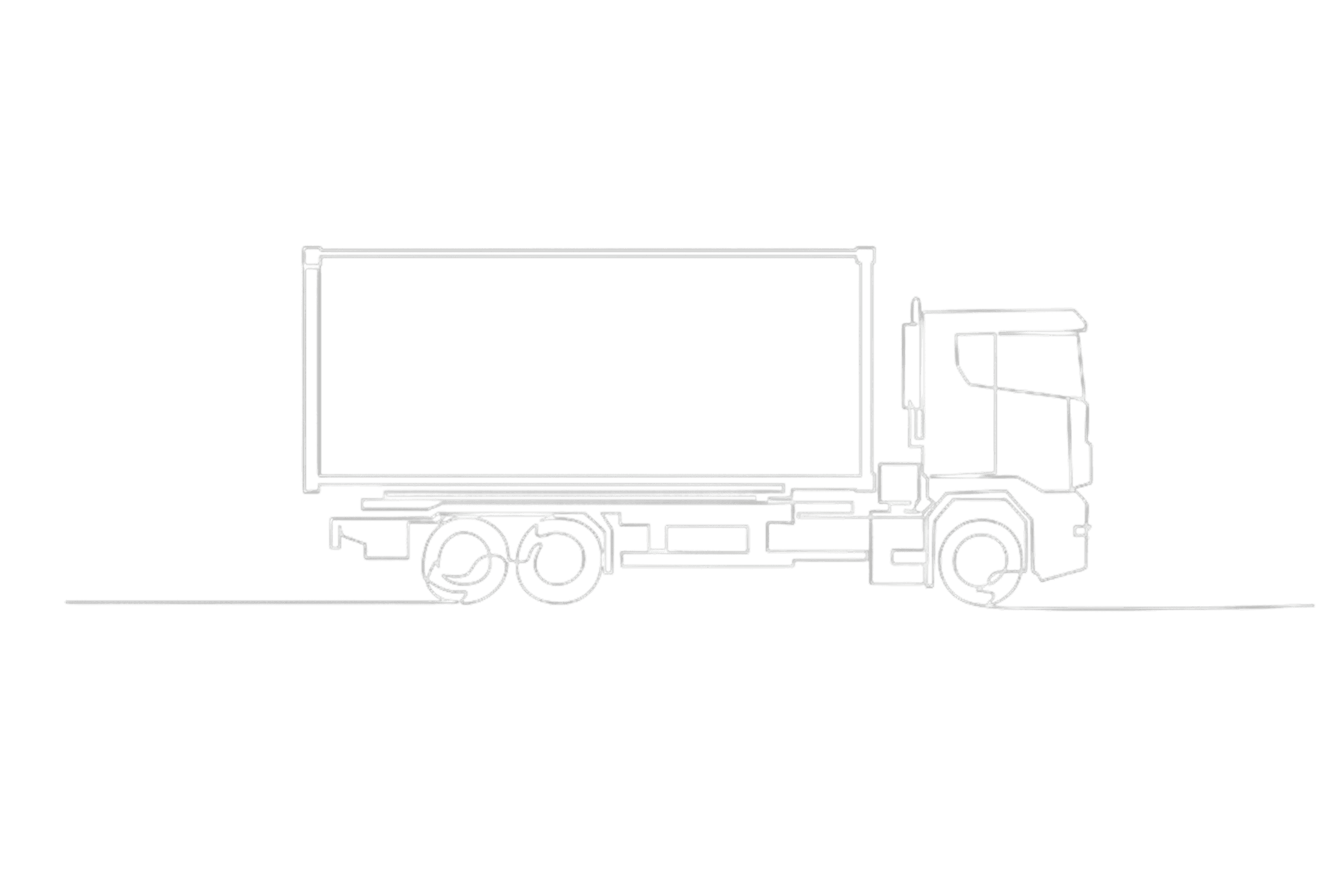
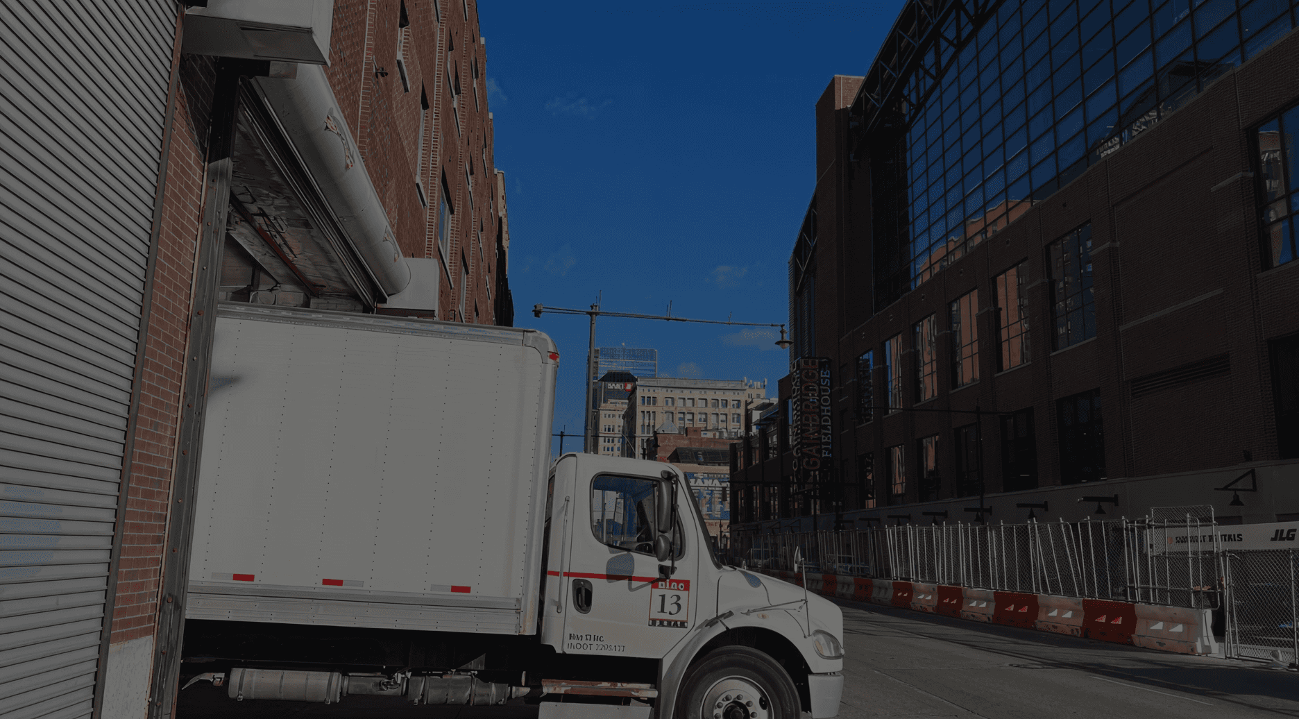
Nine13 Logistics started as a youth cycling nonprofit. During COVID-19, it pivoted into something more urgent — a community logistics operator delivering food directly to seniors, people with disabilities, and families across Central Indiana. At peak pandemic response, Nine13 was reaching up to 1,000 Marion County residents per week.
Operates with a small fleet and a “white glove” approach, delivering every order with care and dignity.
As they scaled, planning became complex, raising questions about when to add trucks, drivers, or routes.
Existing tools handled routing but couldn’t support these decisions, creating a gap our team addressed.
The Problem
Growing on Instinct Isn't a Strategy

Nine13's COO, Ashley, has an extraordinary ability to look at a 7-hour route plan and immediately know it will actually take 8 hours and 15 minutes. That institutional knowledge is invaluable and completely unscalable. When routes go wrong, when a pantry volunteer doesn't show, when a call box is broken and a recipient can't be reached the system bends on the strength of one person's experience.
"What if we add another truck, van, or pantry — how does that actually change our cost and capacity?"
-Tom Hanley, CEO & Founder, Nine13 Logistics
Purdue University's engineering team had already built a powerful mathematical model capable of running thousands of "what-if" simulations. But it was deeply technical — dense with outputs, built for engineers, not for a nonprofit operations coordinator juggling drivers and email chains at 8 AM.
Our task was to bridge that gap: translate a rigorous backend model into a human-centered decision tool that Tom and Ashley could actually use.
What Nine13 Needed
View case
What Was Already There
View case
User Research
Getting Off the Laptop and Into the Truck
We didn't start with wireframes. We started with field visits, ride-alongs, and long conversations with the people who actually run these routes. Two studies shaped the entire project.
Study 1 — Stakeholder Interviews
We conducted semi-structured interviews with Tom Hanley (CEO) and Ashley Acuff (COO). These weren't brief check-ins Tom's site tour ran nearly 90 minutes. We used qualitative coding to pull themes from the transcripts, clustering statements around recurring patterns: delivery delays, scaling anxiety, the gap between digital routes and real-world conditions.
Study 2 — Ride-Along Field Observations
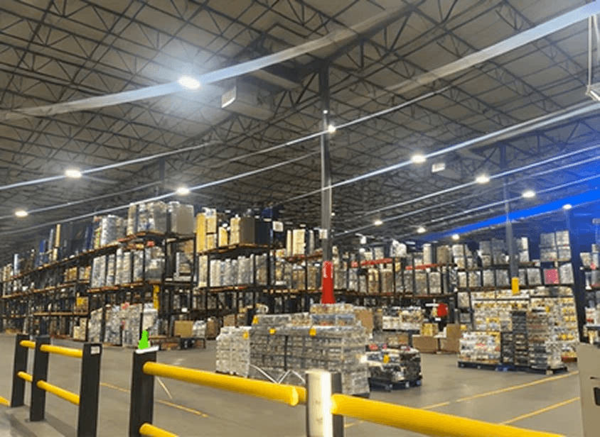
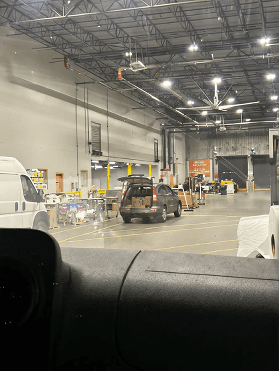
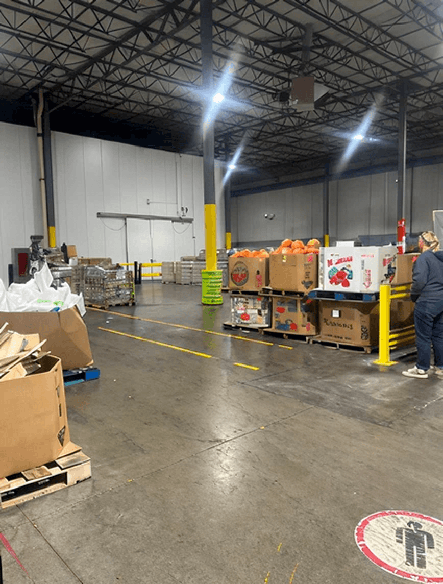
One team member joined the box truck route on a Wednesday morning — observing the full arc from loading pallets at Gleaners Food Bank to delivering to four pantry sites. Another shadowed Ashley on a Monday van route delivering produce boxes door-to-door across Marion County. What we saw confirmed everything we'd been told, and surfaced things no interview could have revealed.

Key Findings
Five Truths About Last-Mile Food Delivery


Defining Scope
Two Layers of Problems, One Deliberate Choice
Operational Challenges
At the operational layer — broken call boxes, failed deliveries logged only in Ashley's memory, scheduling done over email, Midwest Food Bank capacity unknown until the truck is already loading.
Strategic Challenges
At the strategic layer — no way to model what adding a truck, a driver, or ten new pantry contracts would actually cost or deliver.
We made a deliberate call: scope this phase to the strategic decision-support layer giving Tom and Ashley a way to explore growth decisions with real data behind them.
The operational gaps address logging, real-time tracking, scheduling coordination are real, documented, and the right problem for a future phase. This case study covers the strategic layer.
Competitive Analysis
Learning From What Already Exists
Strong conceptual fit
$$$ — not nonprofit-friendly
Strong simulation logic
Complex, enterprise-grade
UX inspiration only
Affordable, browser-based
The Gap We Found
No tool in the market combines strategic what-if modeling with an interface simple enough for a nonprofit coordinator. AIMMS has the logic but not the accessibility. EasyCargo has the usability but not the scope. Our opportunity was to bring these together in plain language, for non-technical users, at zero enterprise cost.
From Research to Design
What Is This Tool Actually Measuring?
Before designing screens, we defined what “better” means for Nine13—captured by two key outputs from the Purdue model for every scenario.
The problem was that this model lived in an engineering environment — dense outputs, no plain language, built for analysts. Tom and Ashley couldn't use it. Our job was to design an interface that surfaces this tradeoff clearly, for non-technical users, in the middle of a busy workday.
Turning Findings Into Direction
📊
📆
👩🏻💻
💻
Side-by-side comparison needs clear deltas. Key differences between baseline and scenario must be obvious so Tom sees impact quickly.
Other Core Experiences
Ask planning questions naturally, conversational guidance walks users through planning decisions with clarifying questions instead of overwhelming input forms, helping them explore scenarios faster.
Update metrics in real time ,as Tom adjusts inputs (trucks, drivers, operating hours), outcome metrics (deliveries per week, cost per delivery, capacity) recalculate instantly so he sees impact immediately, not after clicking "Calculate."
Make scenarios exportable, for funder presentations, board reviews, and planning conversations so Tom can share findings without returning to the tool.
Information Architecture
Structuring a Tool That Thinks Like a Planner
The IA needed to support two modes: Tom's strategic exploration and Ashley's operational planning. We organized the product around five top-level areas, each mapped to a distinct user need.


Wireframes
Setting the Base Flow


User Testing — Round 1
Semi-Structured Interviews


❌
The prototype only worked forward — enter inputs, get outputs. But Amy immediately identified that real planners often work in reverse: given a fixed budget or fleet, what's possible? Without reverse calculation, the tool couldn't support authentic executive decision-making.
📊
Professor Tovar compared it to a bad banking app, data everywhere, but no clear signal about what matters. Metrics were displayed without hierarchy or decision context. Users couldn't tell what to act on.

We expected feedback about features. Instead we discovered the system's core logic didn't align with how experienced planners actually work.
User Testing — Round 2
Think-Aloud Study
Ashley — COO
Completed most tasks but struggled with the reverse calculate feature (4/5 difficulty) and faced too many competing CTAs. Labels were the main blocker, she knew her goal but couldn’t match it to the interface language.
Peter — CSO
Faster with navigation but still struggled with reverse calculate. Key feedback: the “both” delivery option is unrealistic, pantry and home delivery have different cost structures and shouldn’t be modeled together.
Design Response
What We Changed and Why
Redesigned reverse calculate
Made it prominent and clearly labeled, aligned its interaction pattern with forward calculation so users don't need to re-learn the UI.
Separated delivery method scenarios
Removed the "both" option entirely. Pantry and home delivery now have distinct scenario paths with separate cost logic.

Rebuilt the dashboard hierarchy
Primary KPIs elevated to the top, supporting detail accessible but not competing. Benchmarked against banking-style clarity: what's my situation, what changed, what do I do next.
Added chart interactivity
Hover states, tooltips, and inline annotations on all charts so data is interpretable, not just visible.
Final Designs
From Structure to Screen
Explore, adjust, and own your baseline
Compare scenarios, make confident calls
Start from the answer, work backward

Reflections
A tool is only as good as the decisions it changes.
Nine13 now has something they didn't have at the start of this project, a tool that models growth decisions the way they actually make them, in language they can act on, built from the ground up around how their operation really works.
For me, the sharpest lesson was about scope. The research surfaced more problems than one tool could solve. Choosing which layer to address and being honest about what we weren't solving was as important as any screen we designed.
Next: Currently being validated by Nine13's team to see how it holds up against real decisions.